In the history of Google, this is first time they announced an algorithmic change well before its implemented. On 26th Feb 2015, a blog on Google webmaster blog published with the excerpt as
“Starting April 21, we will be expanding our use of mobile-friendliness as a ranking signal. This change will affect mobile searches in all languages worldwide and will have a significant impact in our search results. Consequently, users will find it easier to get relevant, high quality search results that are optimized for their devices.”
My head turned even more when this report published, the mobile friendly algorithm will be larger than Panda and Penguin.
With the above excerpt, two more headlines are equally important,
- More mobile-friendly websites in search results
- More relevant app content in search results
In the USA, 94% people with smartphones search for local information on their phones. More interesting thing is, 77% of mobile searches occur at home or at work where desktop computers are likely to be present. According to Gartner, here is the data of Worldwide Device Shipments by Segment (Thousands of Units).
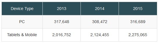
Huge difference in numbers prove the point that internet access through mobile and other smart devices increasing alarmingly and so Google decided to help those users to find out mobile compatible websites only to make their life easy. In the effort, back in November Google launched Mobile-Friendly testing tool for the webmasters. Many took that seriously and made their websites mobile compatible. After sometimes, now it becomes compulsion, either you go with Google and go mobile or forgot those mobile users to come to your website and increase your business.
Now let’s come to the two headlines I have quoted. You have two options to garner those huge number of mobile users. First mobile-friendly website and second is app for smartphones. Let’s discuss how both these options work.
Mobile –Friendly website
There are three ways to get mobile friendly website: Responsive Web Design, Separate URL, Dynamic serving. Let’s discuss all three in detail.
Responsive Web Design (RWD)
Responsive Web Design is Google’s recommended configuration. In Responsive Web Design, all the devices get the same code and the same URLs but layout changes and adjusted to the screen size of the device.
How Google knows that a web page is responsive or not? Google is pretty smart to detect it through page source code, CSS, JavaScript and images. So it is necessary to allow Google crawler to access directory of CSS, JavaScript and images.
Separate URL
Many webmasters feel that Responsive Web Design is not able to serve my content in proper and more readable way. If you have some fine layout ideas for small screens then you can have separate mobile layout with nice look and feel. In that case you will have different HTML source code for each webpage hosted on different domain or subdomain i.e. m.example.com. For this configuration to complete you need to follow two steps.
1. Add rel=”alternate” tag pointing to corresponding mobile URL
2. Add rel=”canonical” tag pointing to corresponding desktop URL
Adding either of these two tags to every page completes the configuration. The major drawback of this configuration is two separate URLs means those are two different pages and you have to do Search Engine Optimization work for both. Ranking of one doesn’t have any impact or either a little impact on the other. So I suggest the use of third option Dynamic Serving over this.
Dynamic Serving
Dynamic Serving works almost same as separate URL as you will have separate mobile website with different mobile accessible lay out. The only difference is, you won’t have different URLs. In dynamic serving a code (written using JavaScript) detect the user agent and then serve the page according. A mobile user will get mobile friendly HTML while a desktop user will be served different HTML even if both accessing the same URL.
How Google will know that you are using dynamic serving? Do this,
1. Let Googlebot know that the content varies based on user agent by using the Vary HTTP header: Vary: User-Agent
2. Treat Googlebot same as you would treat any other device. For example, if Googlebot identifies itself as an iPhone, serve the content for iPhone.
So these are three main options to make your website mobile-friendly.
Now let’s move on to the second important headline “More relevant app content in search results”.
Mobile App Indexing
Let me quote the exact word from the blog,
“Starting today, we will begin to use information from indexed apps as a factor in ranking for signed-in users who have the app installed. As a result, we may now surface content from indexed apps more prominently in search. “
Let me explain it in simple way. Suppose you are a news agency and you have mobile app where people can read your news articles. You can set up app indexing (read step-by-step guide), means your app content will be crawled and indexed by Google. Now someone search for relevant content on mobile and he/she has installed your app, the content from the app will be shown on priority right there in search result. After click the user will be redirected to the app in mobile itself. It ensures more frequent visits of repeat users.
For eCommerce website this is the best way to account repeat users. Your app users don’t need to search in your app instead they can use powerful search of Google and still land on their favorite app for shopping. So for businesses, having an app is now more necessity then casualty.
I will be more than happy to address your question, drop me your questions and I will revert you back in less then 24 Hrs.